

Austin Ackles sat down with Creative Director, Leo Mascotte, to discuss more of his favorite Dempsey & Carroll wedding suites.
AA: This wedding took place on a family property in Old Chatham and we drew a marvelous tree the couple was to be married beneath. (The resulting steel engraving die was a sculpture in and of itself!) What makes this wedding suite one of your favorites?
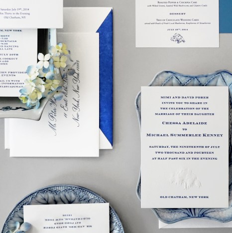
LM: Old Chatham’s charms, to no surprise, are notably old school. This Columbia County hamlet oozes classic Yankee Town & Country charm, and is home to one of America’s most storied fox hunts, The Old Chatham Hunt Club. The blind engraved tree motif could not be more inspired. So too the navy blue and white color palette, classic and crisp, yet decidedly modern for a wedding. These colors perfectly set the stage for this type of “Down East” event. As does the Chevalier font, as naturally handsome as the chocolate labs I imagine sleeping under the couple’s table.

I Would happily take odds that the weekend felt like a trip back to a cherished campus. The Groom and groomsmen in navy blazers, with Hermes ties chosen to recall shared sport. Radiant and crisp in Oscar de la Renta organza, the bride, seemed to be the source of the reception tent’s glow. Her mother, effortlessly triumphant spending an evening at home amongst abundant flowers, planned to appear picked from the property’s gardens.

AA: This wonderful couple was married in the bride’s grandmother’s garden just outside Melbourne, Australia. They loved the watercolors from our Mark Ingram collection (which we used for their save the dates) and they wanted to incorporate them into their wedding suite. I think the colors are delicious!

LM: Tasty indeed, the palette reminds me of tea at Laduree, in Paris. The pale pistachio walled salons filled with a dazzling array of pastel tinted macaroons. The wedding stationery is kept from getting too sweet by the underlying hint of rich ochre in the custom sand colored ink.

Attention to detail here is remarkable. Each piece of the extensive suite was engraved, such a wonderful and increasingly rare touch. Rarer still, each item received edge treatment using a custom pale french pink. The invitation is set apart by it’s exquisite beveled edge. My favorite touch is named Henry B. the couple’s beloved Labradoodle. He sits atop the reply card, bestowing a welcoming glance encouraging all to join.

AA: How we love a perfectly-sized New England church wedding and then a celebration afterwards at a yacht club! This wedding suite is one in a series that is a variation on a very classic theme. How do you see it reinvented this time?

LM: I love the look of this suite almost as much as I revere the venerated yacht club where it was held. This group sets up a carefully balanced interplay of established forms set off against modern elements. A generation ago this piece would have been printed on a folded sheet. Today so rarely used, the foldover’s scarcity may as well predict it’s return to favor. Here, a stiff Embassy card reflects the current currency of chic. This nod to today is set in contrast to timeless Italian script. For me this font remains, the unassailable definition of impeccable old school elegance. The suite’s painted edges are left un-beveled, at once old school handcraft, and not expected. The rich pewter ink color manages a similar duality, with Commodore worthy aplomb.

AA: Dempsey & Carroll has this long running creative partnership with the legendary firm, Schumacher, and this is a beautiful example of our collaboration. The font here feels old and new to me at the same time. What is it that makes this invitation suite at once breezy and stately?

LM: This celebrated print “Birds & Butterflies” was based on a hand printed 1960’s wall covering found in Schumacher’s archive. Available as both a fabric and wallpaper it has a lovely density that never overpowers. Set amongst charmingly drawn foliage, rendered in spare black on white, a flock of colorful creatures takes flight.

The Open Antique Roman font almost seems to have been picked from amongst the fabric’s vines. The letter forms have a polished yet unfussy 1930’s feel. Designer Thomas O’Brien coined the phrase “Vintage Modern” which seems to describes this Schumacher print, the and this this suite perfectly. I can think of no better way to mark a marriage in Millbrook, NY. Very top drawer.
